
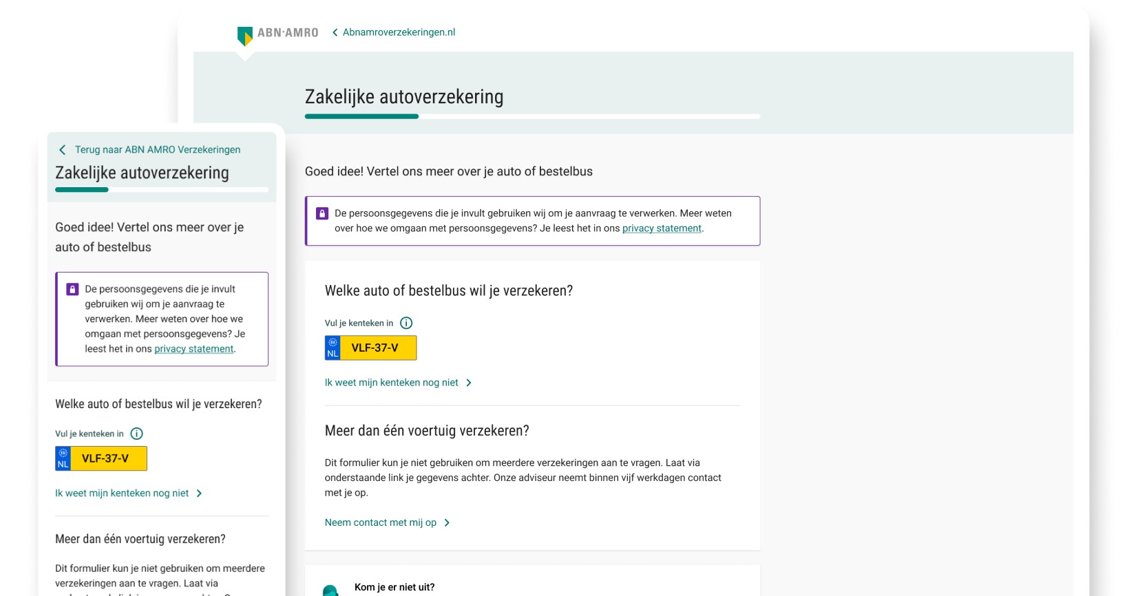
The same 20 sales that previously required 120 requests and 60 hours of processing can now be done in just 6 hours — one tenth of the time.
I was involved in this project from the early design phase to launch and beyond. My role was allround, spanning UI design, UX research, and stakeholder management across all phases. Throughout the project I worked closely with multidisciplinary teams including developers, marketeers, content writers, product owners, customer journey managers, and business analysts.
ABN AMRO Verzekeringen is the insurance branch of ABN AMRO Bank, offering various business insurances to Dutch entrepreneurs and companies. Business car insurance was sold through quote requests, after which customer service would call the user back to finalise the policy. The process was human-intensive, slow for users, and hard to scale.
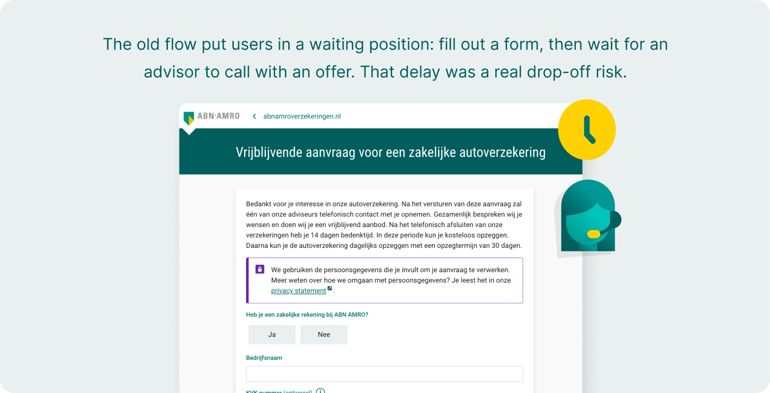
The old process had a large cost in both time and conversion. Every insurance application had to be handled manually by customer service. 120 incoming requests generated only 20 sales, requiring 60 hours of processing.
The goal was to design a digital funnel that would allow business owners — primarily ZZP (freelancers) — to take out a car insurance completely independently, reducing pressure on customer service while increasing conversion.
Upfront user interviews with freelance business owners showed what mattered most when taking out a car insurance. Three core needs came up:

Transparent pricing from the start — users wanted to know what they were paying before committing to anything.
No upsell pressure — the car insurance is a one-time decision. Users wanted to get it done without pressure.
Low mental effort — users wanted the process to require as little cognitive effort as possible throughout.
With the user insights as a foundation, I organised a series of workshops bringing together developers, product owners, business stakeholders, and analysts. The goal was to brainstorm, collect, prioritise, and select the core features of a concrete MVP scope that would set the base for the first launch of the funnel.
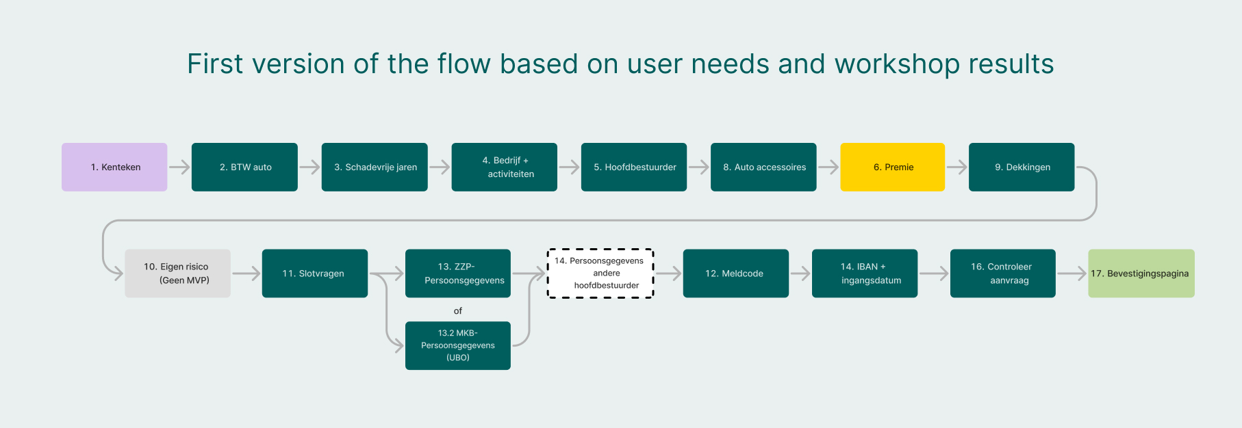
Taking out a car insurance requires a large amount of information from the user — the challenge was to collect all of this without making the process feel overwhelming.
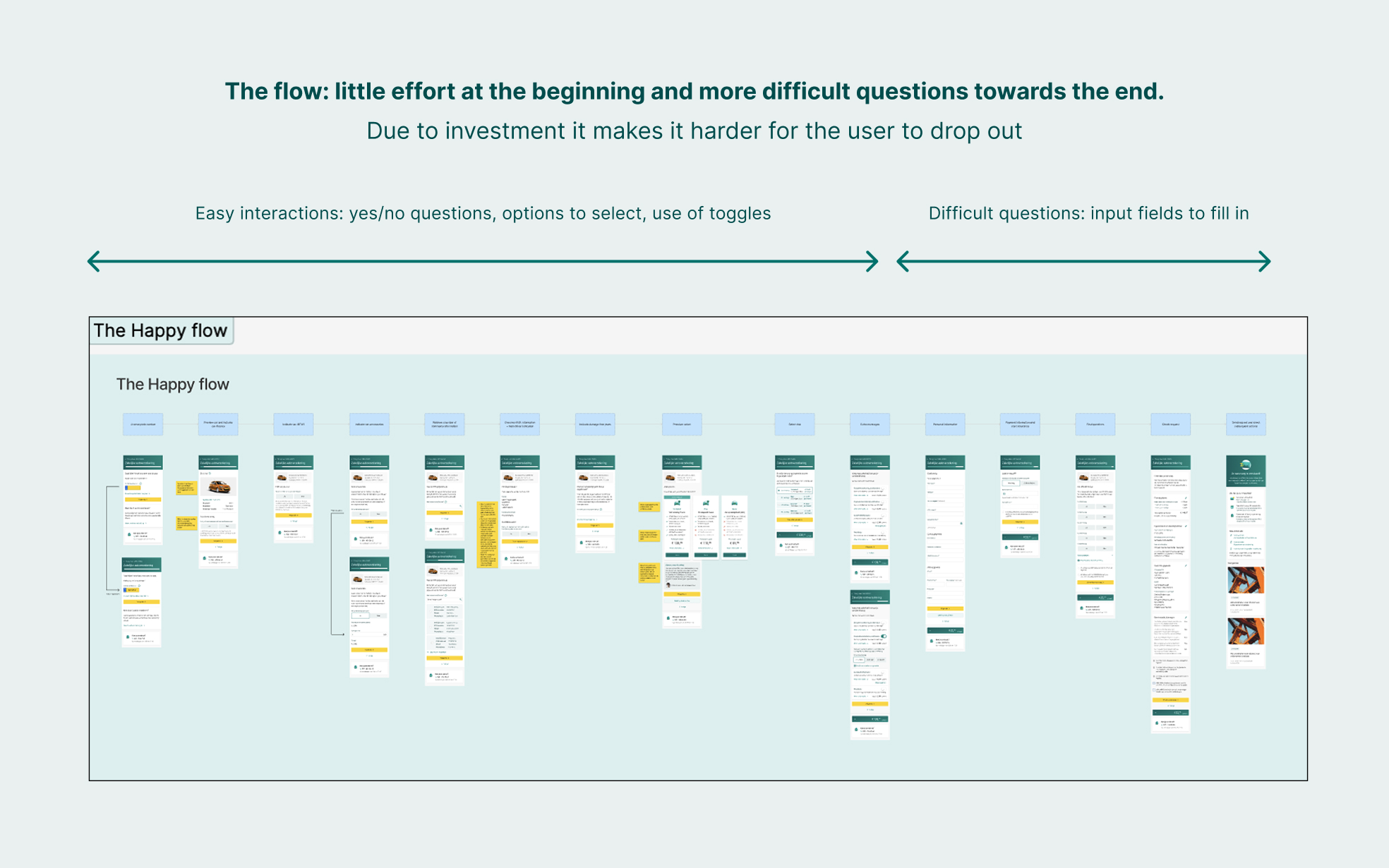
An important early design choice was how to structure the funnel: easy interactions first (yes/no questions, license plate lookup, choosing options), harder tasks last (personal details, payment information). By the time a user reaches the more difficult steps, they have already invested enough that dropping off feels like a waste. This approach also kept the beginning of the funnel feeling light and accessible — important for a process that users often find intimidating.
Throughout the design, a conversational approach was used — informal, friendly language to keep a complex process more approachable.
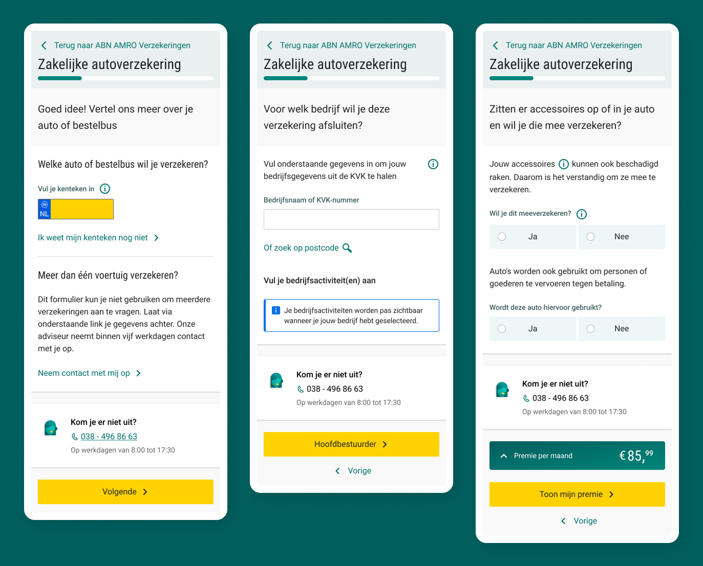
The central research question was: how can the usability and flow of the car insurance funnel be improved to better match the needs and wishes of the ZZP entrepreneur? To find answers, I ran a usability test with real users on a prototype of the complete flow, followed by a post interview.
Key findings included:
Copy problems & information overload
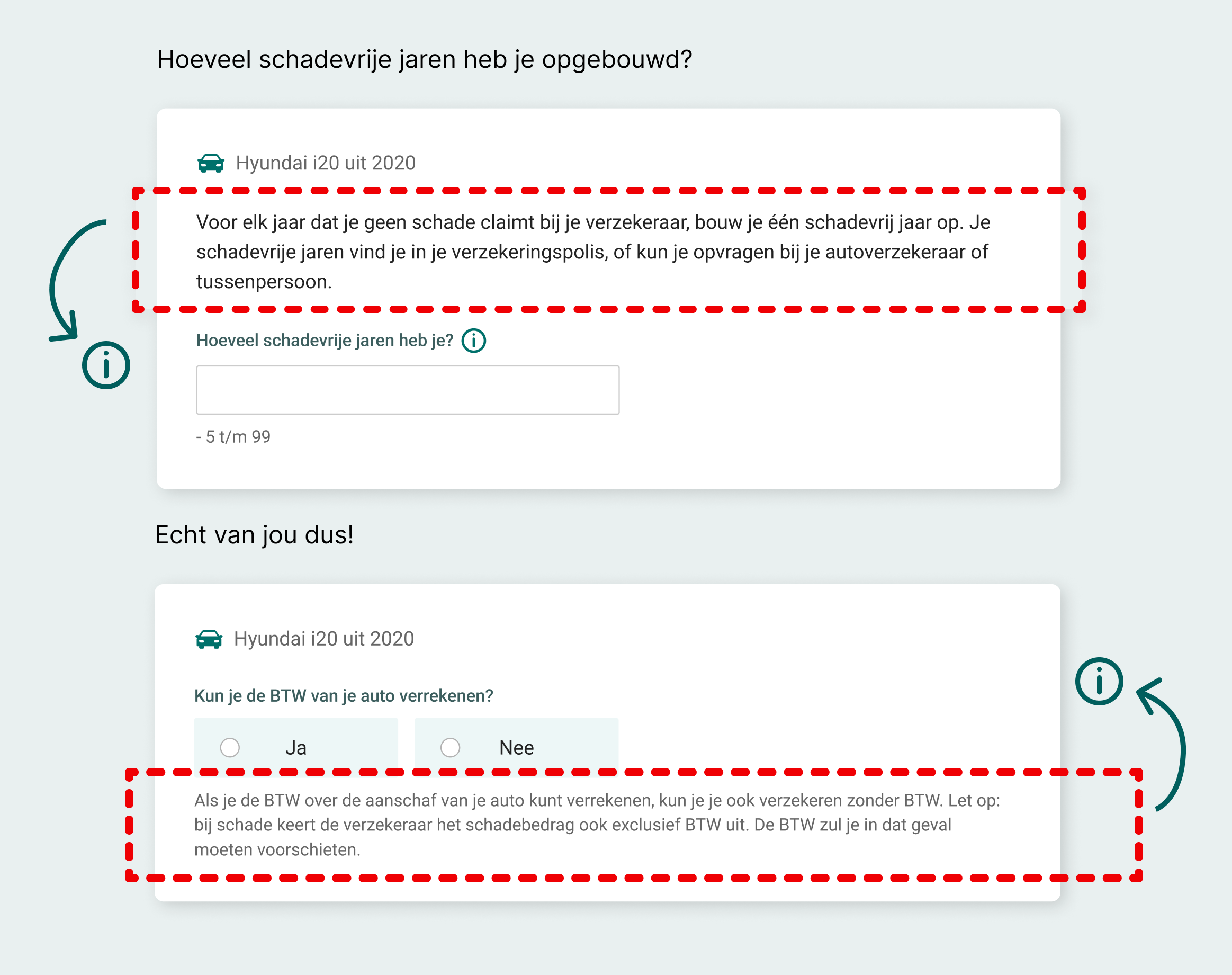
The CTA label "aanvragen" (apply) felt too committal; users preferred softer language like "bereken premie" (calculate my premium). Dense terminology and information overload risked funnel drop-off.
Misalignment of the flow
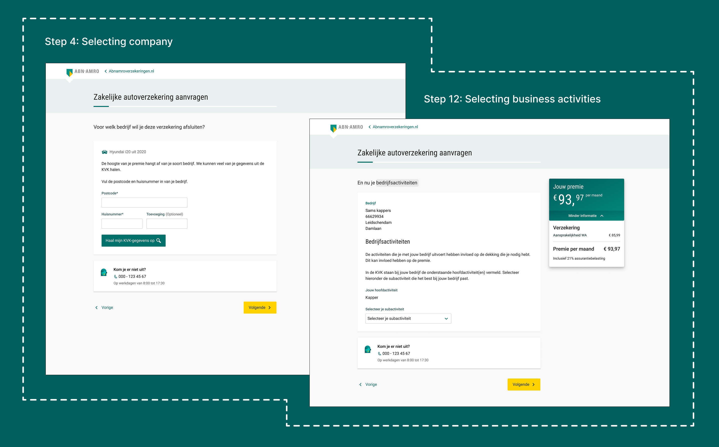
Some users expected certain steps to be combined or placed elsewhere, such as company lookup and business activity selection being separate steps — users expected these to appear together in the flow.
Expectation management
Users found it difficult to know what to expect in the next step and to track their progress through the funnel. Buttons with "volgende" (next) needed to state the next step, alongside a clear progress bar.
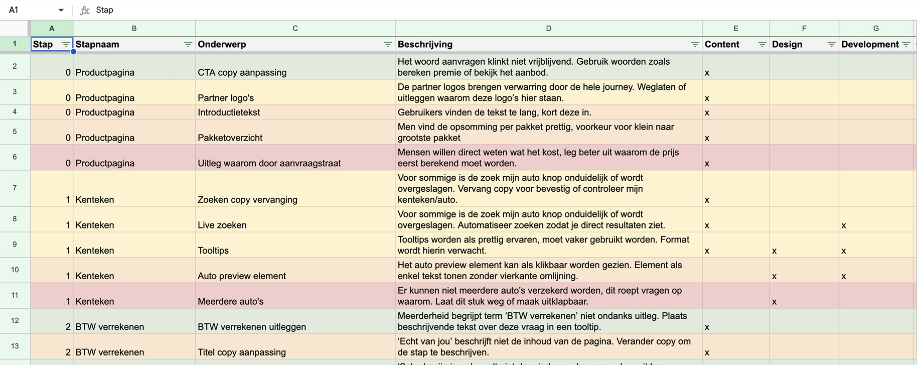
After the usability test, I categorised all improvements by type — content, design, development — and ordered them from most to least impactful. This formed the basis of a workshop I organised with stakeholders to decide which improvements would make it into the MVP.
By inviting stakeholders to observe the test sessions beforehand, the user got a real face. This made it much easier to keep the improvement debate grounded in actual user experiences rather than each team's own priorities.
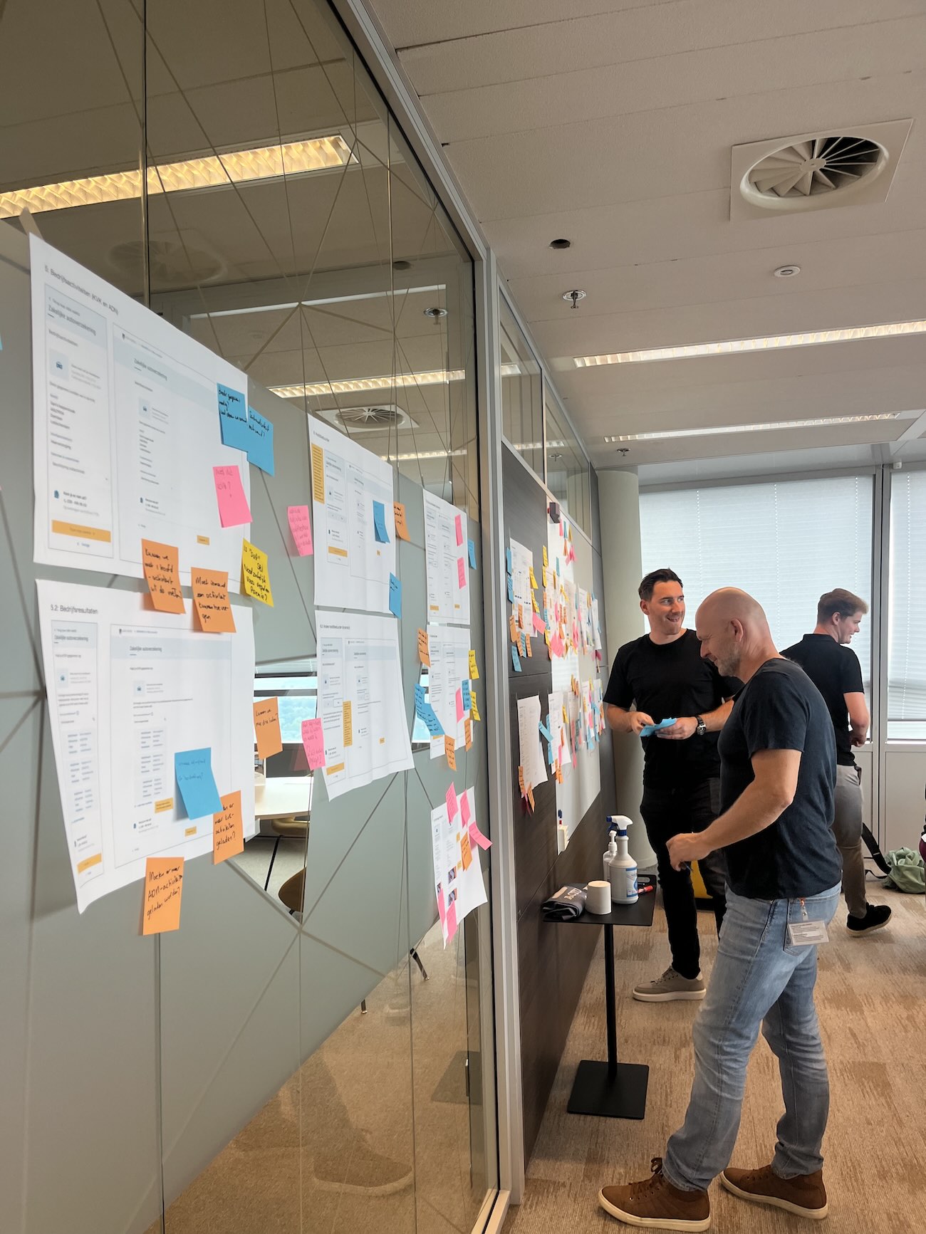
Protecting the MVP scope
Throughout the project, stakeholders regularly proposed new requirements beyond the original scope. My role was to guard the MVP boundary — keeping the first release focused on what was essential, and saving everything else for later.
The ZZP vs MKB debate
Despite 95% of actual buyers being ZZP, stakeholders consistently pushed to build for MKB — a more complex user group requiring additional steps and inputs. I made the case for ZZP-first using sales data and a clear UX principle: design for the largest user group first, then expand.
The KvK business activity selection problem
The business activity selection step had grown into a three-layer decision tree with over 600 activities — far too complex for users to navigate. After analysing how competitors handled this, I proposed introducing keyword-based search so users could find their activity in plain language.
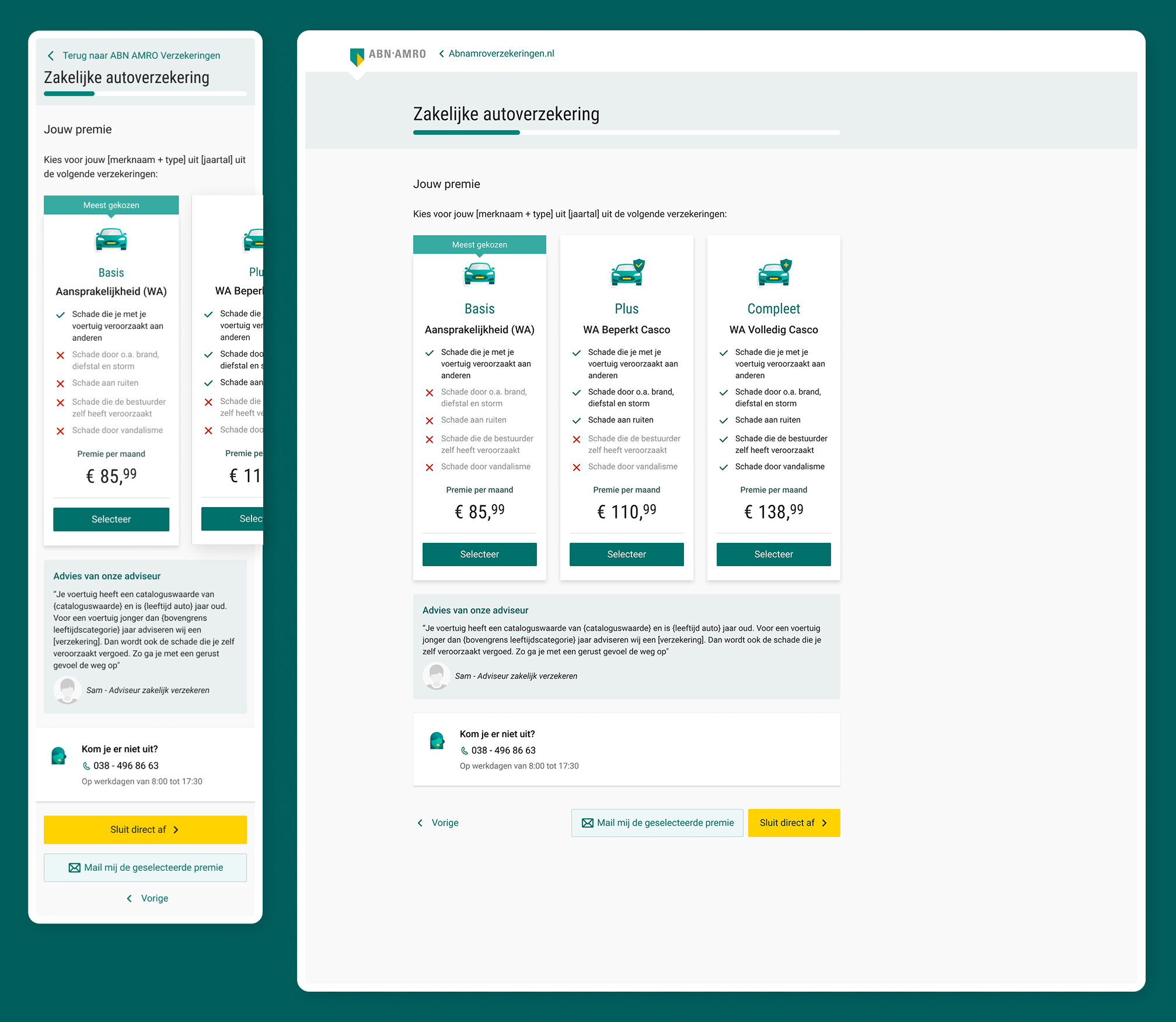
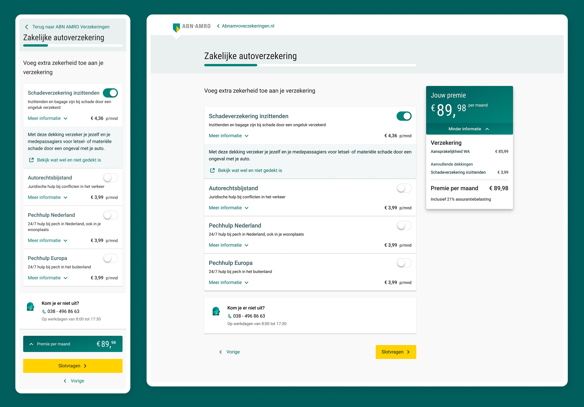
After the official launch, iterations kept being made. I proposed per-step analytics across the funnel, allowing us to conduct smaller, more targeted usability tests based on where the data showed users were dropping off.
Business owners are now able to take out a car insurance policy by themselves, without the need of a quote request. The same 20 sales that previously required 120 requests and 60 hours of processing could now be done in just 6 hours — one tenth of the time. Customer service pressure dropped, and the funnel created a foundation for continuous iteration.