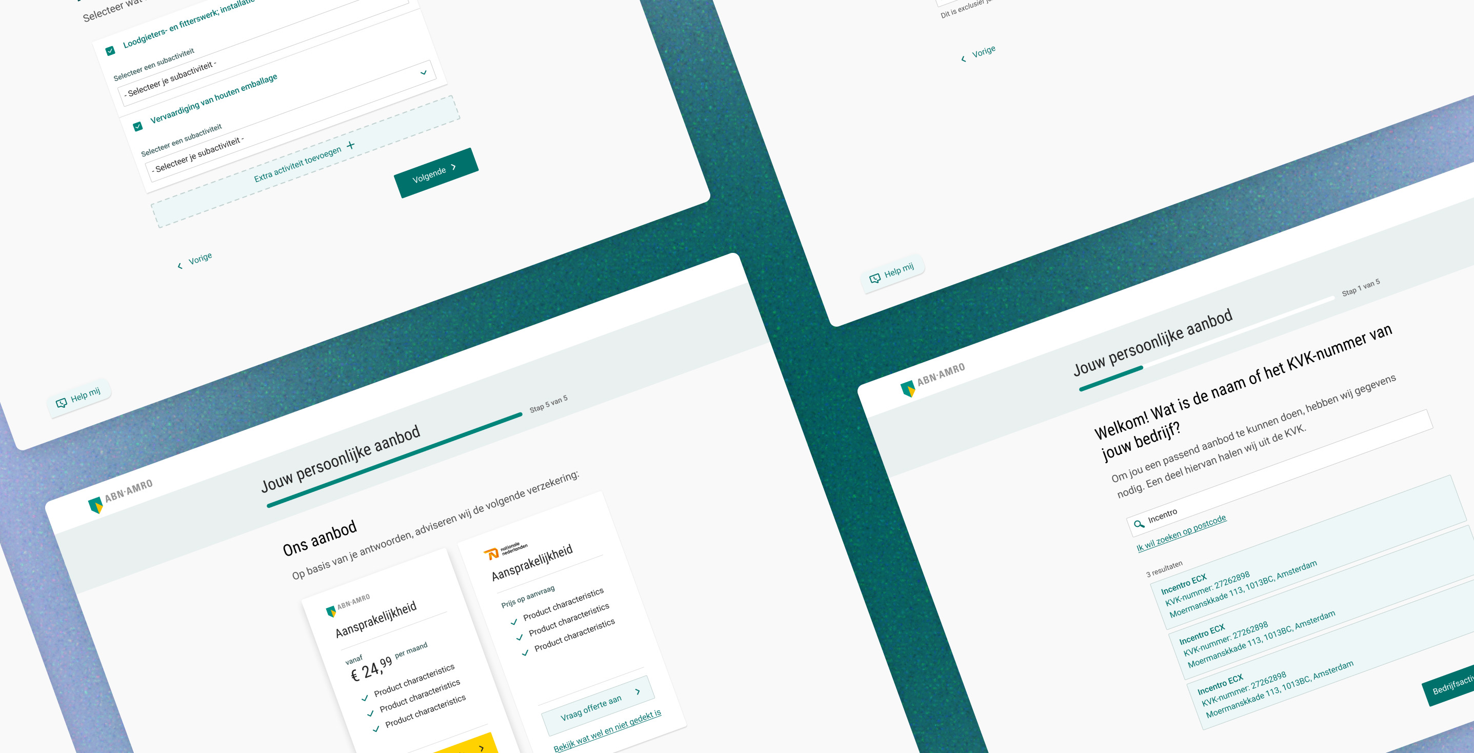
ABN AMRO Verzekeringen is both an insurer and an intermediary — offering customers products that genuinely fit their situation. Historically, a business owner landing on the website would jump straight into a product checkout funnel without knowing whether that product was the right one for them.
Business owners had no quick or simple way to determine which insurances were right for their company. The options were: contact customer support, read through lengthy product pages, or start an application funnel just to see a price — without knowing if the product was right for them.
The goal was to design an onboarding tool that would identify a business owner's company profile and serve them a personalised set of insurance recommendations. Once advised, they could proceed directly into the relevant application flow.
Using insights from previous user interviews, I distinguished two user modes: orienting (exploring, comparing options to understand what they need) and no idea (do not know where to start, need guidance or a human advisor).

Easy comparison — users wanted to easily compare insurance options.
Simple application forms — users wanted the application process to feel simple, not another lengthy form.
Clear guidance — users wanted clearer guidance on what they actually needed as a business owner.
I organised a series of workshops to define the scope of the MVP. Working with the Product Owner, Business Analyst, Developer, Marketeer, and Customer Journey Owner, we determined:
Limited input — which data points were essential to generate a personalised insurance recommendation, keeping the number of inputs as low as possible to avoid a lengthy process.
Available company information — what information users would realistically have available (e.g. KvK number, sector, annual revenue estimate).
Placement in the journey — where in the customer journey the KvK Onboarding step should be placed, since users arrive from emails, product pages, and other entry points.
Linking to application funnels — how the recommended products would link back into the relevant application funnel.
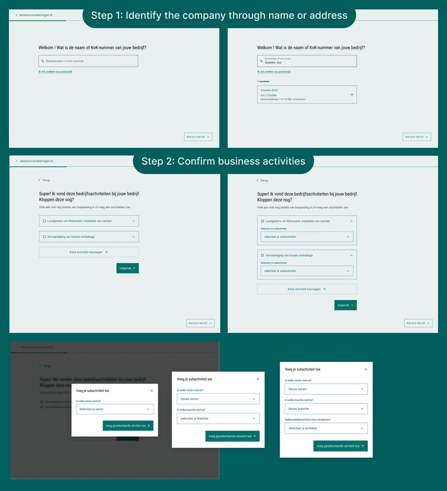
The resulting MVP flow was structured as follows:
Step 0: Entry — user arrives from a product page or external source
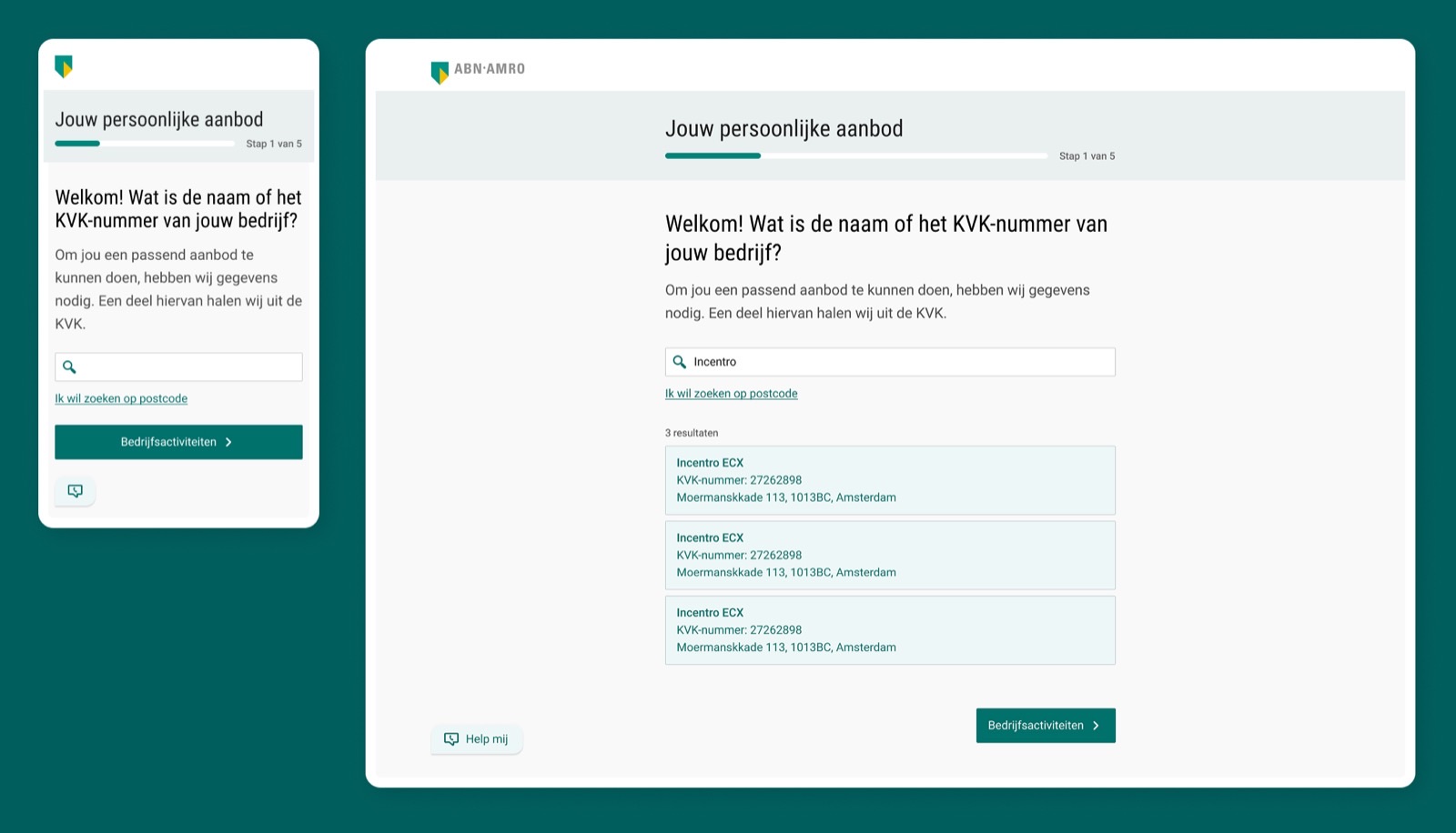
Step 1: Identify the company — by entering their company name or KvK number, their business details and activities are retrieved automatically
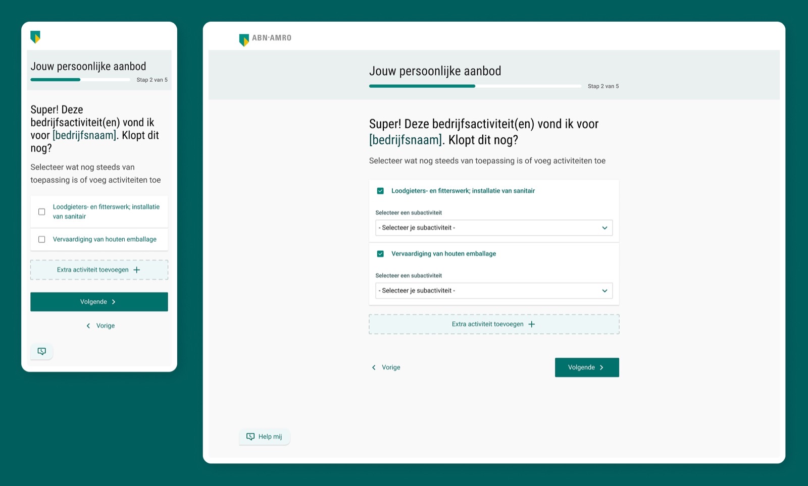
Step 2: Confirm business activities — since KvK data isn't always up to date or complete, users are asked to verify and adjust their business activities if needed
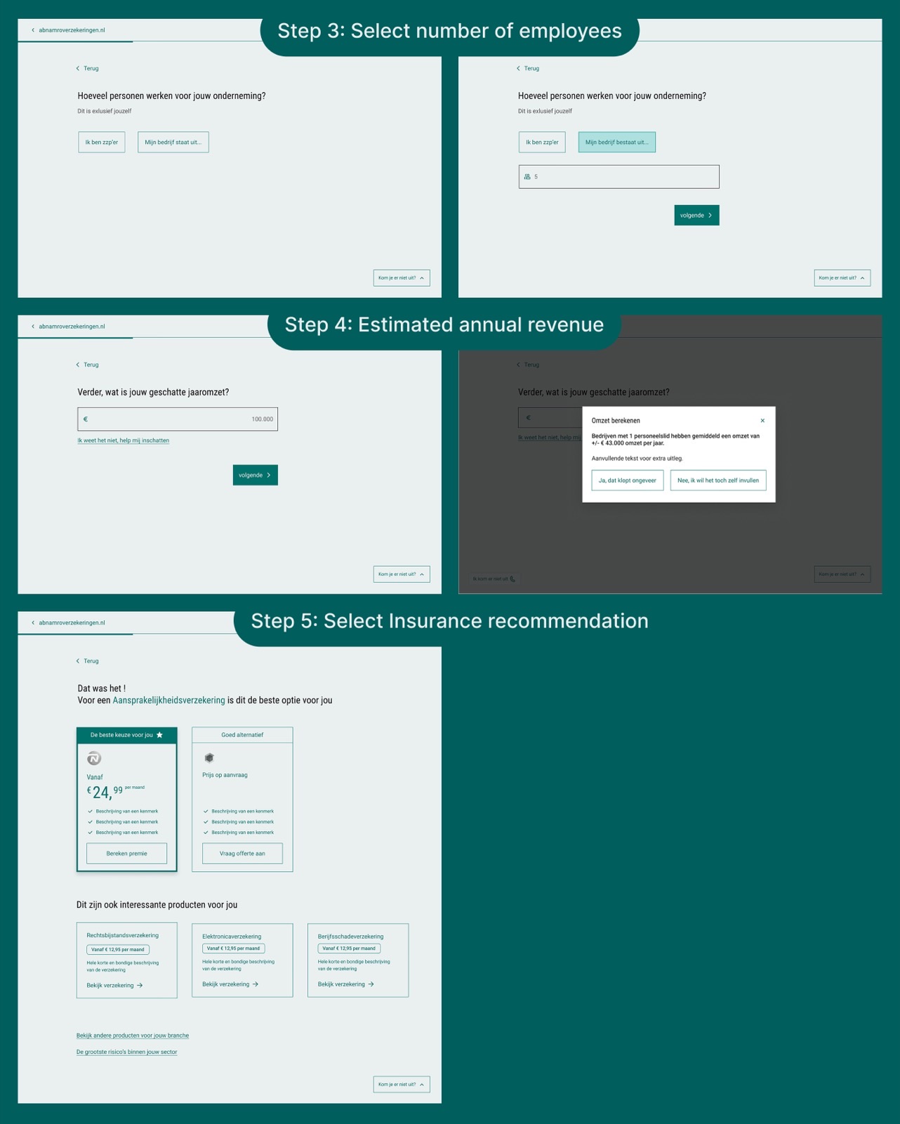
Step 3: Number of employees — influences both the insurance offering and the monthly cost
Step 4: Estimated annual revenue — also used to calculate the right insurance offering and monthly cost
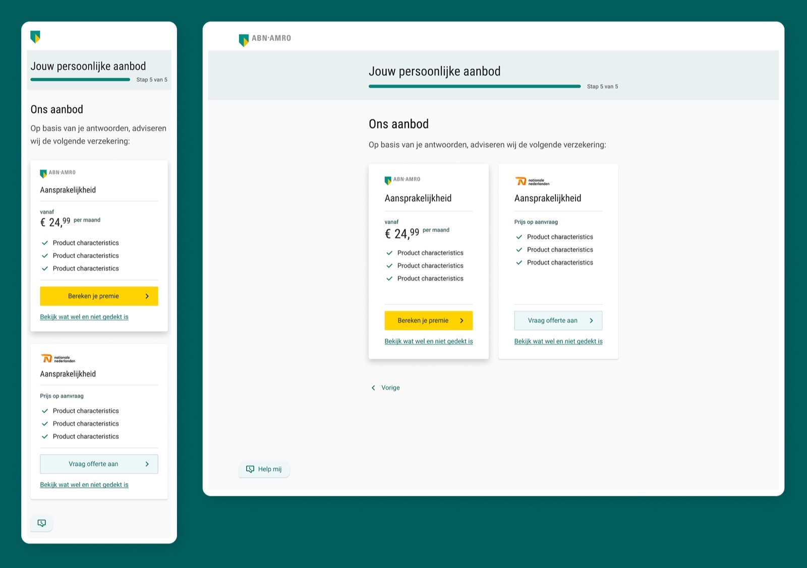
Step 5: Insurance recommendation — personalised to the business profile, with a path to the application funnel

Business insurance is complex and often intimidating. The experience needed to be light, clear, and conversational — like a smart advisor asking just the right questions.
To reduce cognitive load, the flow was structured with one question per screen. Combined with the KvK API — which automatically retrieves company information — users could move through the flow quickly and with minimal effort.
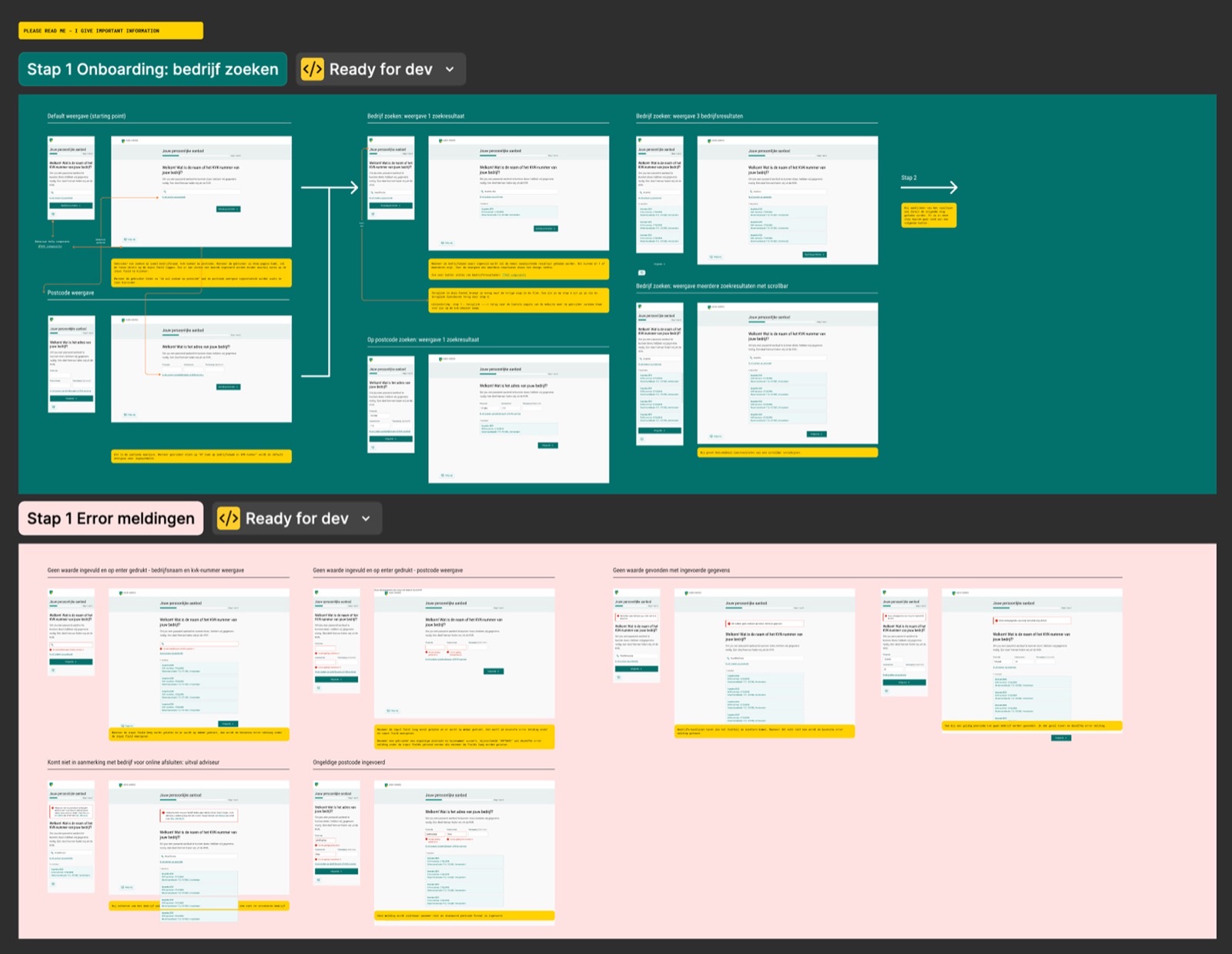
The design phase resulted in a set of wireframes, which were then brought to a creative peer review session with Nationale Nederlanden to gather expert feedback before moving into high-fidelity.
I organised and facilitated a creative expert review session with lead designers from Nationale Nederlanden and its partner brands.
Improve navigation (interaction) — Always show the next step's name in the progress indicator. If an answer needs no extra input, move on automatically — don't make users click "next" for nothing.
Explain the "why" behind questions — Add explanations for why certain information is being requested (e.g. "If you fill this in, we can provide a better premium estimate"), which reduces friction and builds trust.
Strengthen the product recommendation step — In step 5, the insurance cards should include social proof elements. They should clearly explain what the recommendation is based on.
These insights directly shaped the next iteration of the wireframes, which were then translated into high-fidelity designs.
Time was the biggest constraint on this project. There was very little room to design, validate, and launch the tool — which meant user testing with real business owners wasn't feasible within the given timeline and budget.
Instead, the expert review session served as the best form of validation. Not only was it a valuable learning moment, but as fellow insurance companies, these lead designers had built similar orientation tools themselves — making their feedback relevant.
By moving the orientation experience online, we create a customer journey that is both simple and flexible — meeting customers wherever they are in their decision process. Guiding for those still orienting, and personal for those who need extra support.
The Insurance Onboarding project is a step toward that vision. The next steps include improving the recommendation page and further addressing the feedback points from the expert review session.