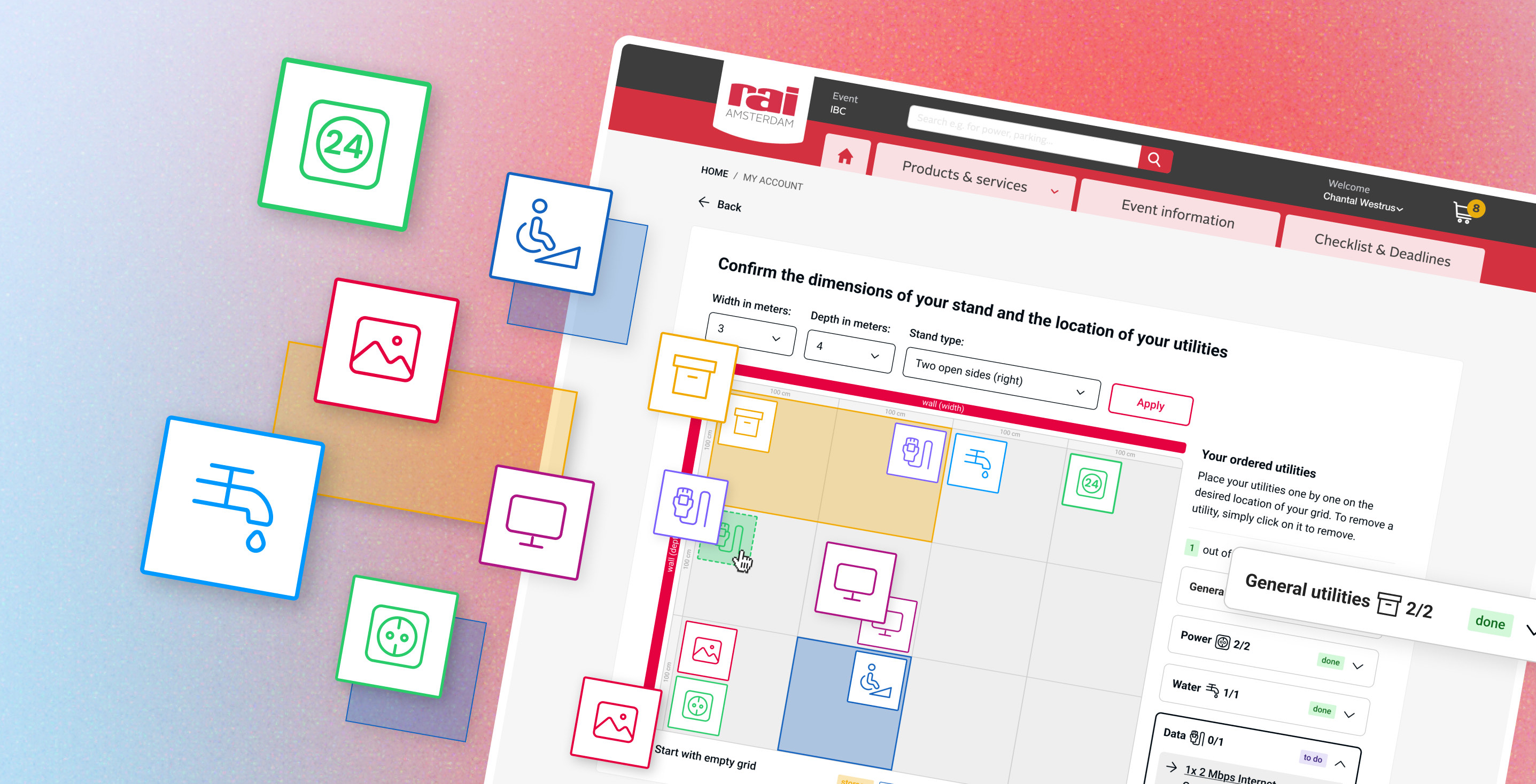
RAI Amsterdam is a large event and congress centre hosting hundreds of events every year. Beyond providing space, RAI offers a wide range of services that exhibitors can add to their stand: power connections, water, internet, storage, TV screens, and more.
Once an exhibitor purchases a stand package with associated utilities, a plan needs to be generated — one that tells the RAI installation team exactly where each utility should be placed within that stand. Exhibitors managed their stand customisation through several channels — email, a webshop, brochures, and direct contact with Exhibitor Services.
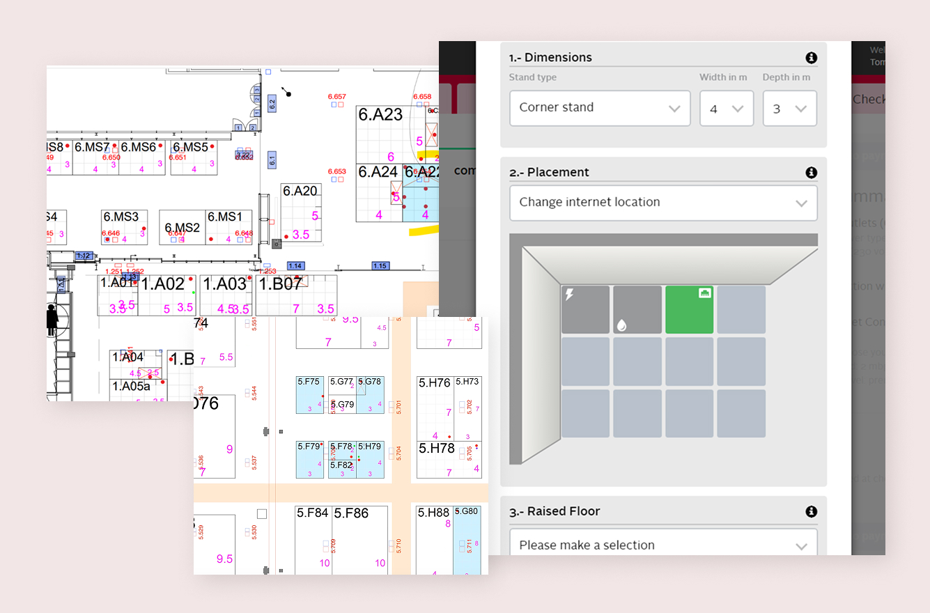
The process of customizing a stand happened across several channels, making it fragmented and inefficient. The existing online placement tool added to this: it could only register a single instance of each utility type. If an exhibitor ordered three power connections, the tool could only place one — meaning every multi-unit order required manual follow-up by phone or email.
RAI's customer support team absorbed the consequences: a high volume of tickets, constant back-and-forth, and occasional mistakes that only surfaced during stand build-up.
The goal was to design a self-service configuration tool — integrated into the RAI webshop — that would let exhibitors manage their entire stand independently, without needing to contact support.
There was no formal user research phase on this project. Instead, I worked closely with the RAI Exhibitor Services team, who brought a lot of knowledge about how exhibitors actually behave and what tends to go wrong.
One of the first things I mapped out was the full set of utilities that needed to be placed in the grid: power, water, data / internet, TV screen, wall image, storage and wheelchair accessibility.

The tool needed to:

Support placement of multiple instances of the same utility type
Give exhibitors real-time feedback as they place items
Adapt dynamically to stand dimension adjustments and purchase data
Being able to upload an own stand design (PDF or other formats)
Be intuitive enough for users with varying levels of technical experience
I started by mapping out the full user flow — from entering stand dimensions to placing the last utility. From there I moved into sketching and low-fidelity wireframes in Figma, iterating on the placement interaction and the structure of the sidebar. Each round of iteration was shared with the Exhibitor Services team and development team for feedback, which shaped the decisions below.
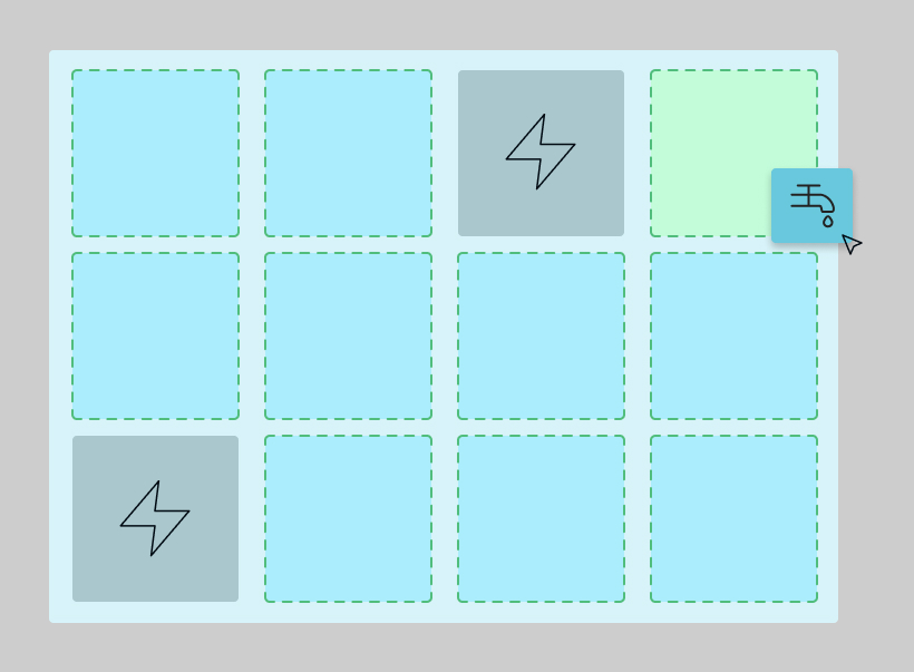
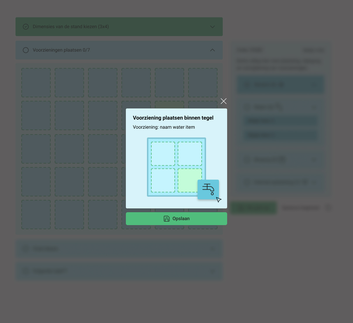
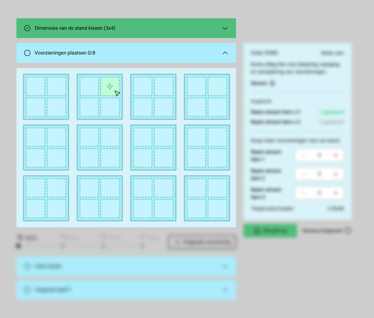
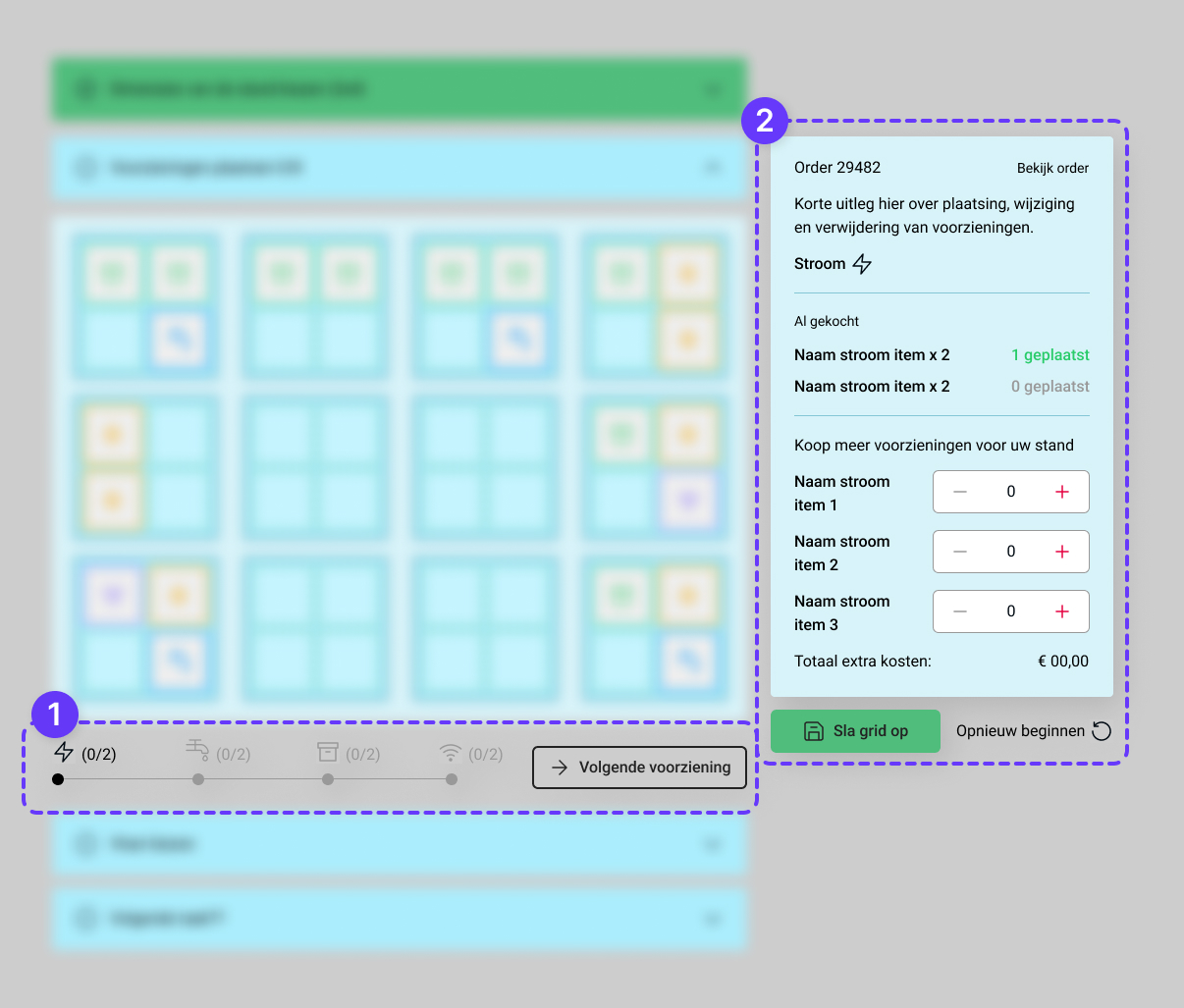
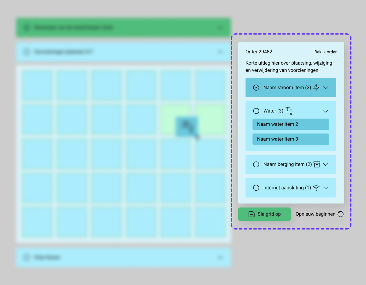
The structure of the sidebar was important. It showed which utilities had been purchased, placed or needed placement — overall showing progress on laying out the stand. Two designs were made: one leaned into upselling additional utilities, the other prioritised a smoother, faster flow for placing them. We opted for the second one (2nd image), since the main objective was placing utilities — not necessarily upselling new ones.
Stand builders flagged walls as key reference points for placing utilities, so I made wall setup a required first step — exhibitors define their dimensions and mark open sides before placing anything, giving context for placement decisions. The grid also had to work across sizes from 3×3 to 20×10 metres or more, so I worked through edge cases like long, narrow stands where the grid's aspect ratio could become a problem.
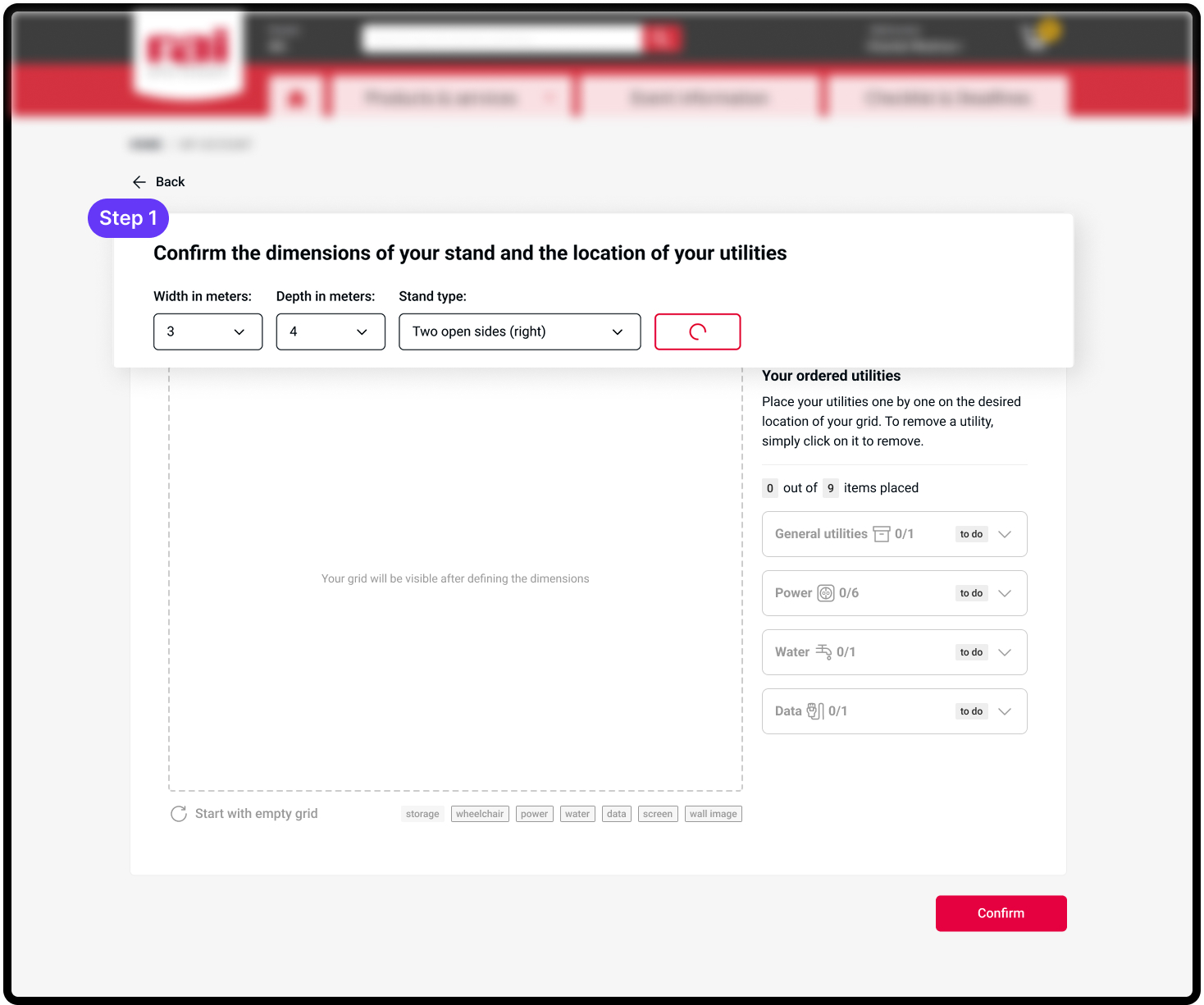
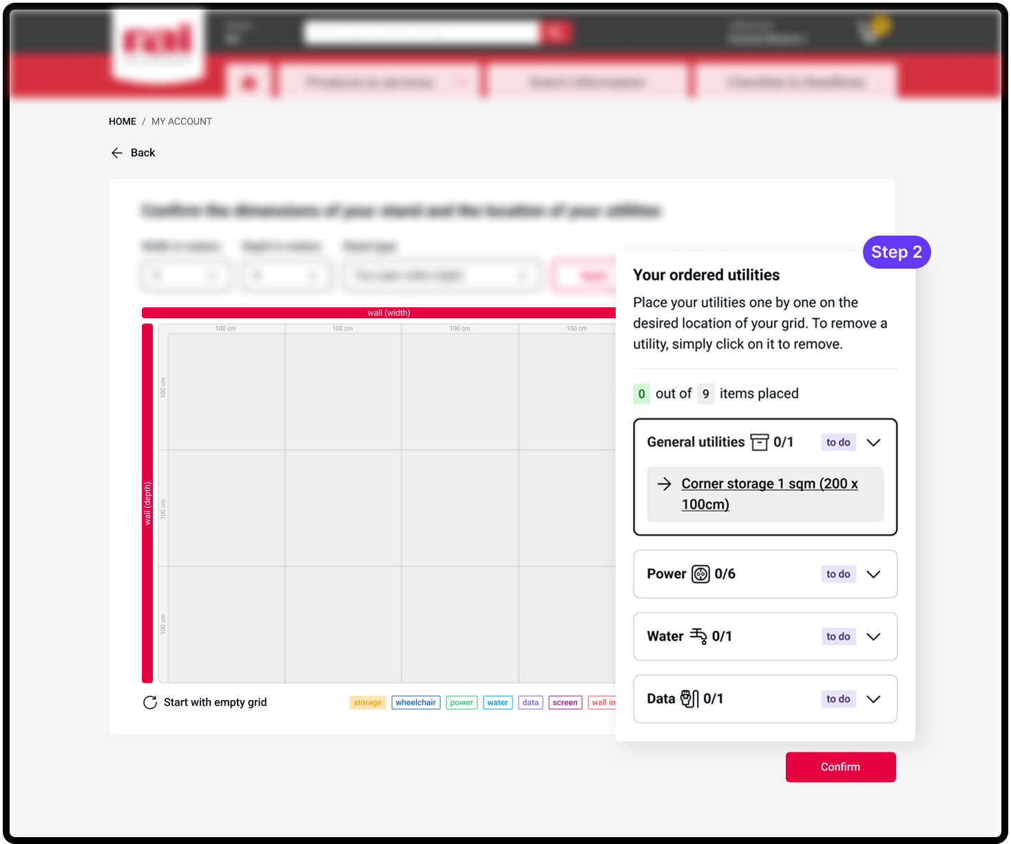
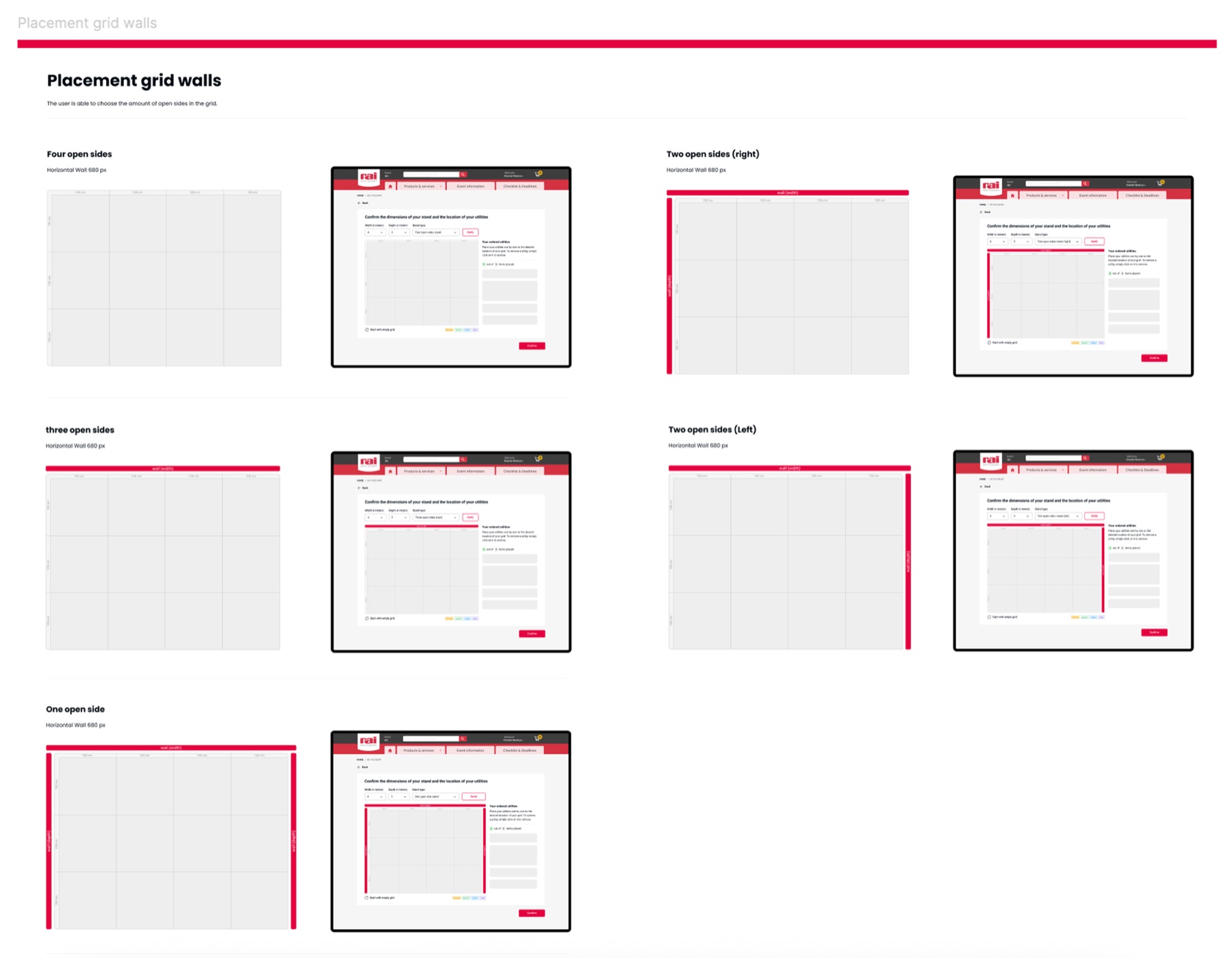
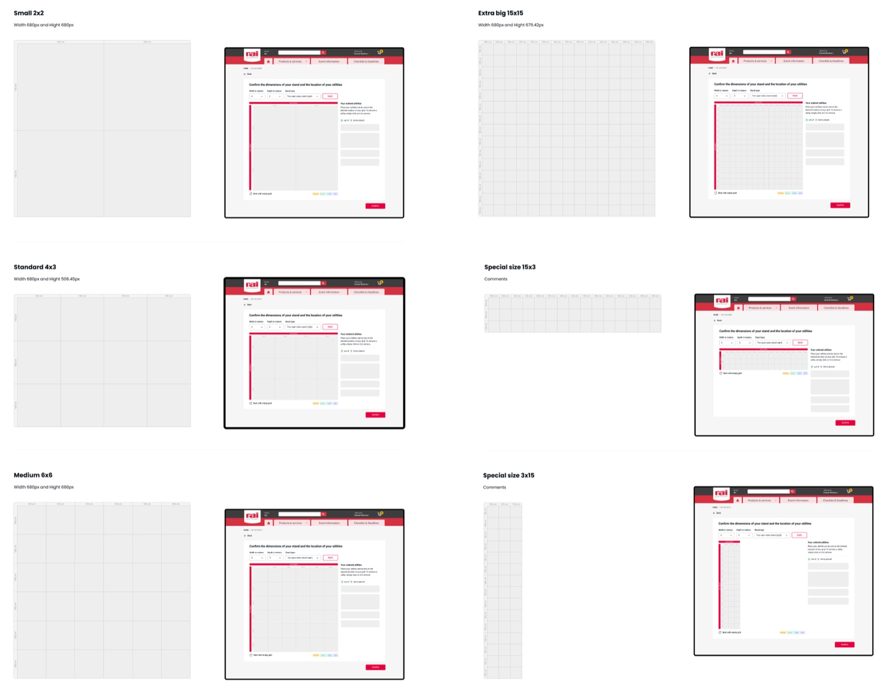
The auto-advance selection — speeds up the placement flow. Otherwise every single item had to be selected to be placed. Moreover, placement constraints were made visible at the relevant moment. Items could easily be removed as a bin-icon would show on hover over these utilities and utilities were easily traceable on the grid through hover in the item-list.
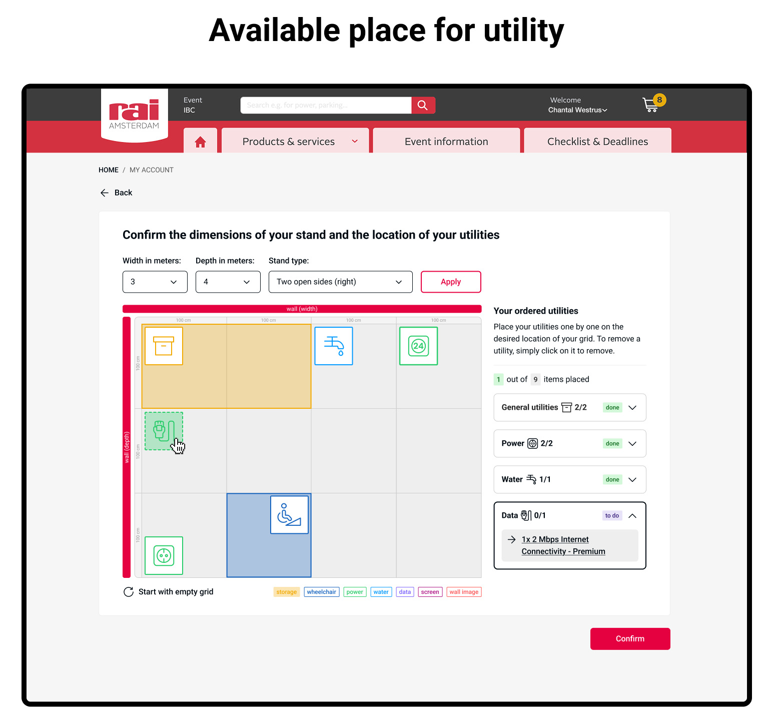
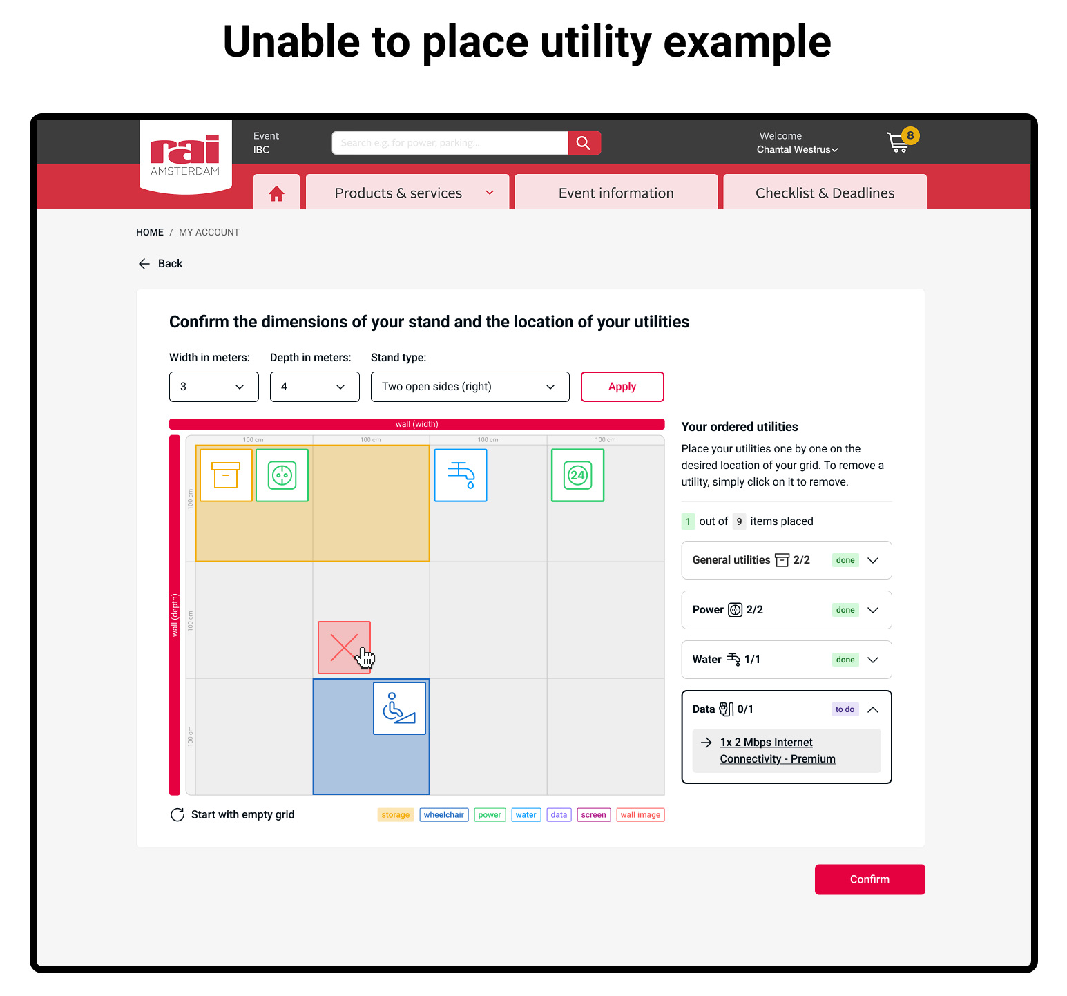
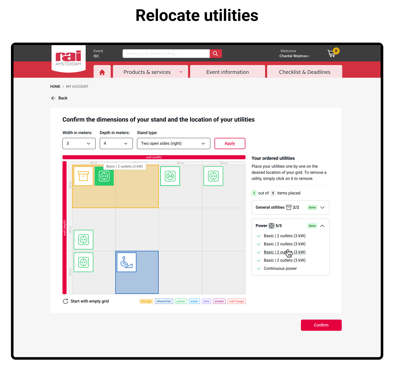
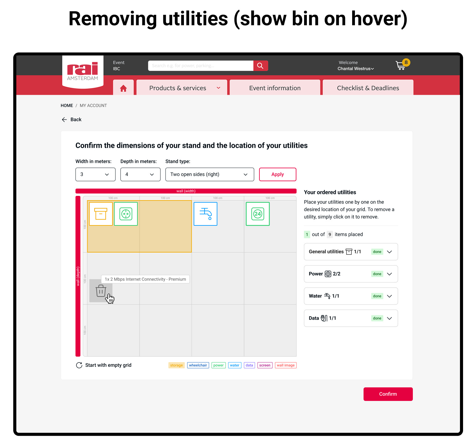
The full set of placement rules for all utility types was not documented anywhere: it lived in the heads of the Exhibitor Services team. Obtaining and understanding these rules through stakeholder conversations was a big part of the early design work.
Making the grid resize responsively — and remain usable at both small and large stand sizes — was technically and visually tricky. Icons and labels needed to remain readable, and the grid proportional regardless of the stand dimensions entered.
This is the first concept and prototype for the new Standconfigurator — designed as part of a broader effort to rebuild the RAI website. The prototype gives the standbuilding team a clear plan to build from. Further iteration will continue as the website rebuild progresses.